CONTACT EXULT
Salome van den Berg
Phone us
076 377 0293
salome@exultiq.co.za
We have office and representation in
- Johannesburg
- Cape Town
- George

OUR BRAND
Iconography:
OUR EXULT icon is simple in form, yet deep in meaning.
The converging lines represent many ideas, experiences, and perspectives coming together as one — collective intelligence activated with intention. It reflects the convergence of insight, experience, technology, and human wisdom.
At the centre is an ignition point — a moment where potential is released. Where ideas meet, clarity forms, and something new is activated. This is what we do and bring!
The wing-like form suggests lift, momentum, and expansion. It echoes the symbolism of angel wings — messengers, guides, guardians. We see our role as one of stewardship: helping to guide, protect, and strengthen the brands, businesses, and people we partner with.
The red “X” in our EXULT name introduces disruption and courage. It signals distinction — a willingness to challenge convention, think differently, and step beyond the expected. It is the moment where alignment becomes action.
When diverse, authentic minds come together with intention, something powerful is unlocked.
Our Black and white canvas– represents our foundational truth and principles.

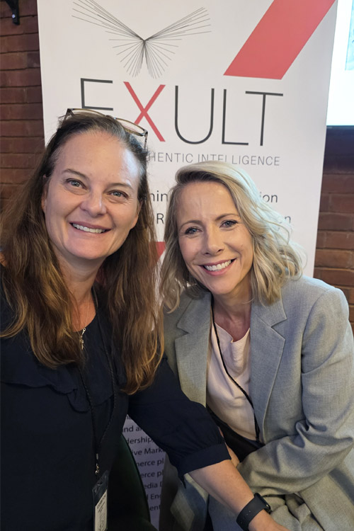


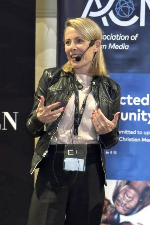
Ten years in — just getting started!
Ten years has sharpened our judgement, deepened our relationships, and strengthened our belief in what truly works.
EXULT today is confident, grounded, and clear — and more excited than ever about what’s next